Product launch
My primary challenge with the Working NYC launch was to create a new brand identity and user interface that templatizes 30+ programs across 9 industries from multiple providers serving a diverse population of New Yorkers.
Program Taxonomies. This table showcases 3 of the 7 finalized taxonomy collections for programs on the site that I would need to accommodate in the product's design.
| Provider Services | Populations | Industries |
|---|---|---|
| Help finding a job | Youth in foster care | Transportation |
| High School Equivalency (HSE or GED) prep | Young adults | Healthcare |
| Internship or short-term job | Immigrants | Technology |
| Improving English skills | People with disabilities | Construction |
| Training for a new job | NYCHA residents | Media and entertainment |
| Adult reading, writing, and math | Public assistance recipients | Food service |
| Adults | Industrial and manufacturing | |
| Older adults | Security | |
| Low-income New Yorkers | Maintenance and janitorial | |
| Women | ||
| LGBTQ+ New Yorkers | ||
| People with justice involvement |
Brand identity
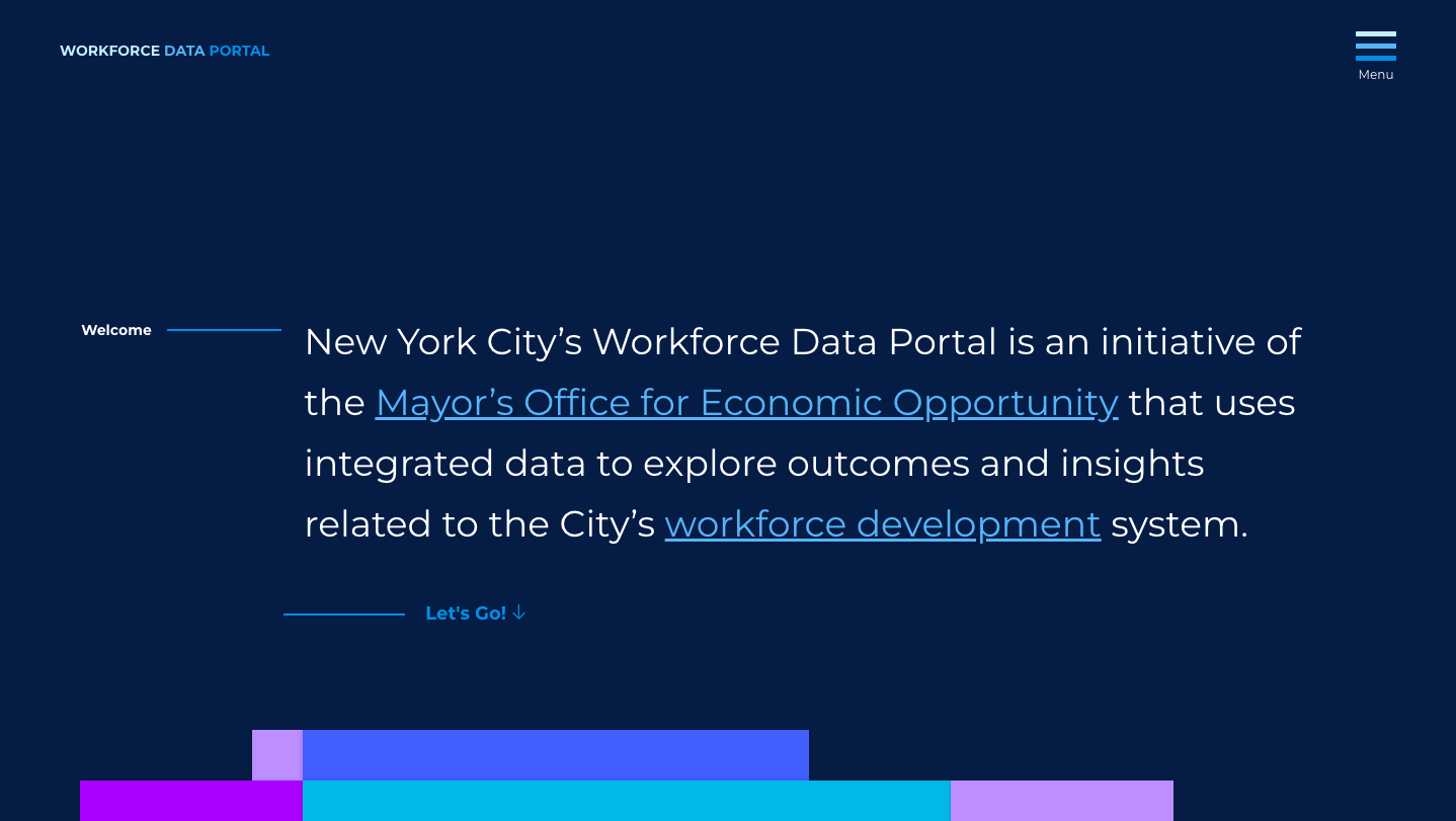
The direction for the brand identity was to use design tokens from a previous project created in collaboration with the Mayor's Office of Workforce Development to keep the product within a family of Workforce products. This project was called the Workforce Data Portal. I extracted the token set from the project, including typography and colors, and expanded it to create a brand identity system.

The initial sketches for the brand identity logotype include considerations for the different industries and services offered by programs.


User interface
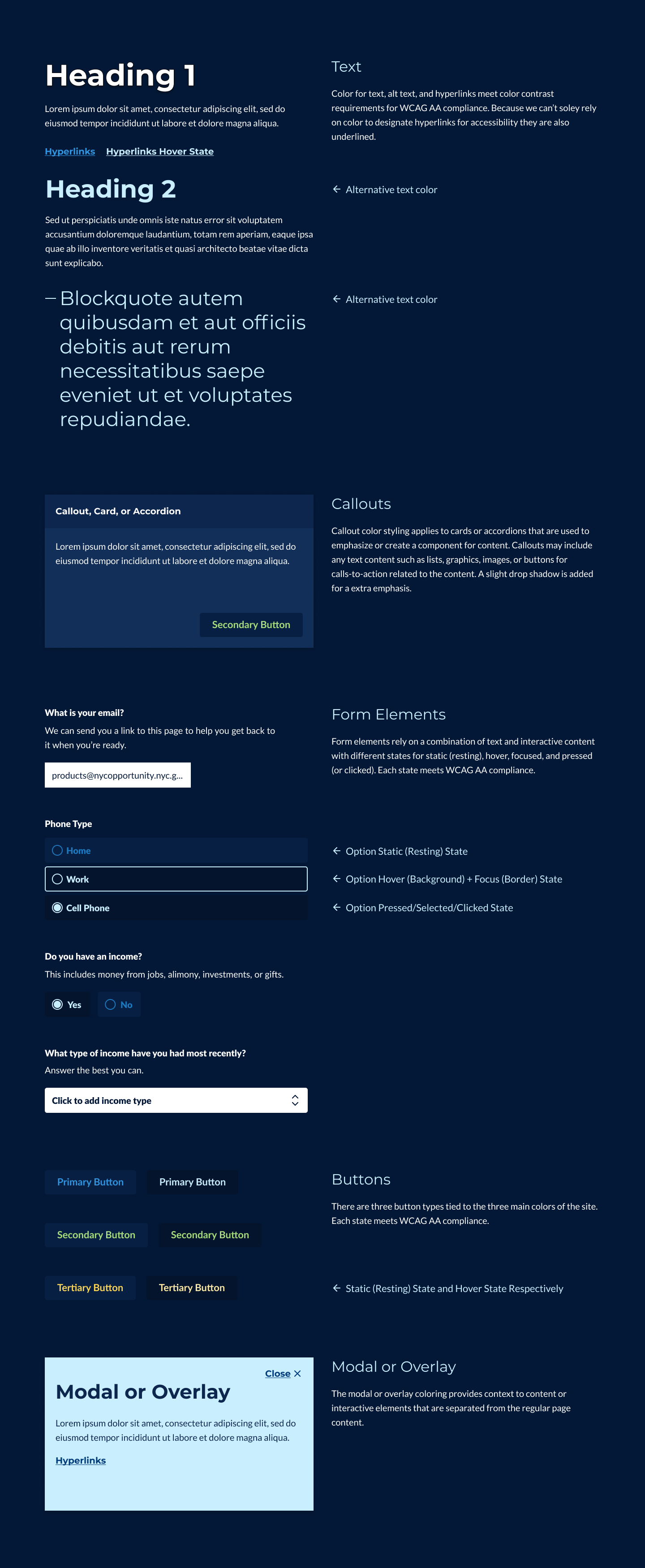
Drawing on the foundation of other products in our portfolio, I designed and built (in code) a production-ready version of a pattern library explicitly created for New York City resident-facing products. This library includes 38 elements, components, and utilities; multi-lingual stylesheets with support for 11 languages, left-to-right, and right-to-left reading orientations; and meets Web Content Accessibility Guidelines (WCAG) AA compliance.
Views
Our strategy for the site was to have the content to lead the user experience. To build the views, I used content priority guides (created by our content strategist) in place of wireframes. I applied the finished pattern library to build the site's primary view templates in static HTML pages. The views were designed and engineered to make the product feel like a progressive web application to accommodate our end-users browsing behavior (observed through analytics of other products in our portfolio). We reviewed these pages internally and with our agency partners, and because they were live prototypes, the team could experience and review the designs as they would exist in production.
Program pages
Content priority guide. This table showcases the content priority for our content specialist's program page template.
| Program Page Content Priority Guide |
|---|
| Occupation |
| Program title, provider, and agency |
| Recruiting? |
| Program description |
| Services and outcomes; what the program offers; certifications; industry sector |
| Who it’s for; eligibility at a glance and what makes someone a good match. |
| Schedule; duration, location, and other details. |
| Next Steps; how to apply and deadlines. |
| Contact; website, phone, or email. |
Static HTML design. I used the content priority guide to build out the view. I added UI elements such as the sticky utility navigation, breadcrumbs, recruitment badge, typography styling of the content, newsletter sign-up module, site footer, and mobile navigation and menu.
The static HTML prototype I created using the Working NYC pattern library.
Homepage
Homepage Outline. I designed the homepage by developing an outline for interactive features and UI elements. The features on the homepage help funnel users to the most relevant information on the site based on their interests, including a questionnaire, scrollable program collection template, and announcement template. I then worked with our content specialist to develop UI copy, program collections, and announcements for the page.
| Homepage Outline |
|---|
| Global site alert |
| Site name and tagline |
| Questionnaire |
| Program Collection 1 |
| Program Collection 2 |
| Announcements |
| Newsletter |
Questionnaire. The questionnaire turns the program taxonomies into a friendly question and answer format to help users filter and view programs based on their responses.
| Homepage Questionnaire |
|---|
| Answer a few questions to get started. |
| Which of these best describes you? Select one category from the population taxonomy |
| What kind of program fits your schedule best? Select one category from the schedule taxonomy |
| What do you want to gain from job services? Select one category from the services taxonomy |
| Submit button |
The initial sketches for the homepage include considerations for the different user behavior flows and background graphics to help balance the page's design.
The static HTML prototype I created using the Working NYC pattern library.
User acceptance testing
We conducted remote user acceptance testing with program managers and participants from the NYC Parks Opportunity Program to gauge interest and uncover usability issues with this product iteration. With their valuable input, we could make all of the changes needed to launch the project's first version.
A total of 5 content, design and engineering sprints began in May 2020 and ended in a launch on August 20th (13 weeks).
Final final
The site's design is a collection of open-source code and public Figma file that can be scaled up as the product evolves. I also created internal documentation for all of the historical context behind the design so that team members can understand design decisions. You can browse the GitHub repository and the Figma file following the links below.