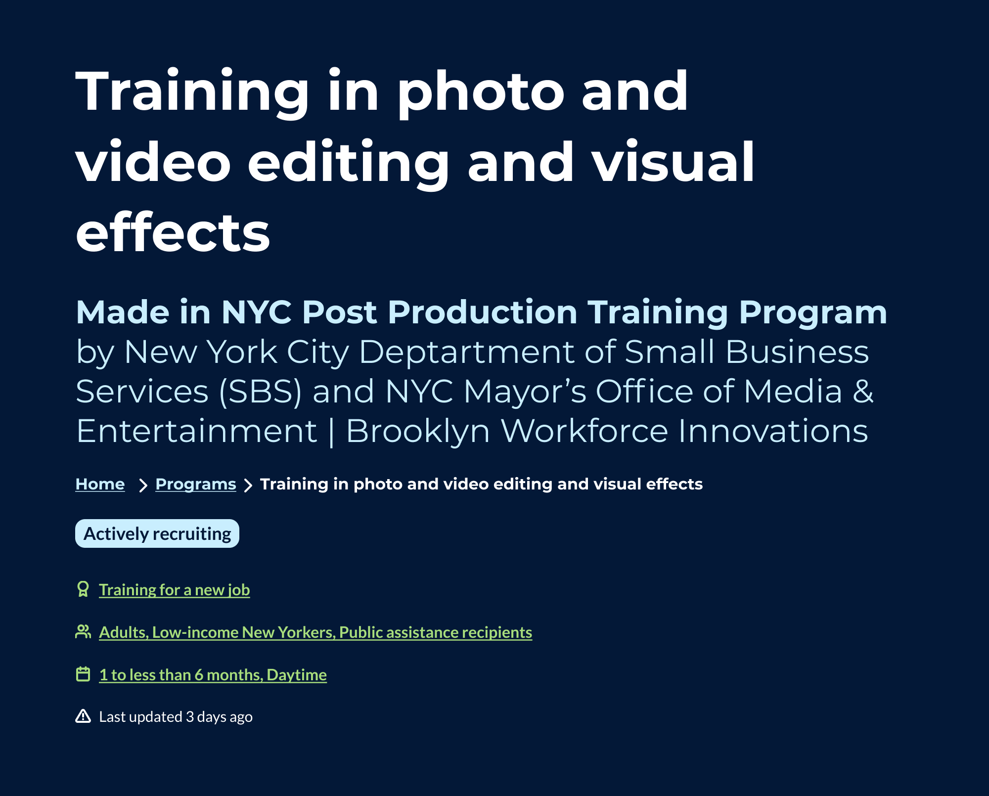
Inclusive design pattern iteration
After the launch of Working NYC our team solicited feedback from stakeholders on the product. We received over 100 responses to a survey that included information on favorite features and where we could make improvements. Using Airtable, I synthesized the qualitative data by extracting and counting the occurrences of keywords and phrases. I then organized these items into the following feedback categories.
- Site features – how respondents felt about existing features or features we could add.
- Design qualities – how respondents felt about the design of the site or how we could improve it.
- Suggested programs – additional content that we could add to the site.
- Overall goals – ideas respondents had that fit with our overall goals.
- Content – how respondents felt about the existing content.
The most common point of feedback respondents had regarded the website's general design qualities. The color palette came out as the most liked and disliked feature within this theme. We hypothesized that a new color palette would improve the site experience for some users. However, we didn't have a holistic view of the problem because we weren't certain how to resolve the positive and negative feedback color palette.
We decided to iterate on the site design and talk to our audience and stakeholders about the issue to understand how we might better meet their needs and goals by addressing it.
From color preference to inclusive design patterns
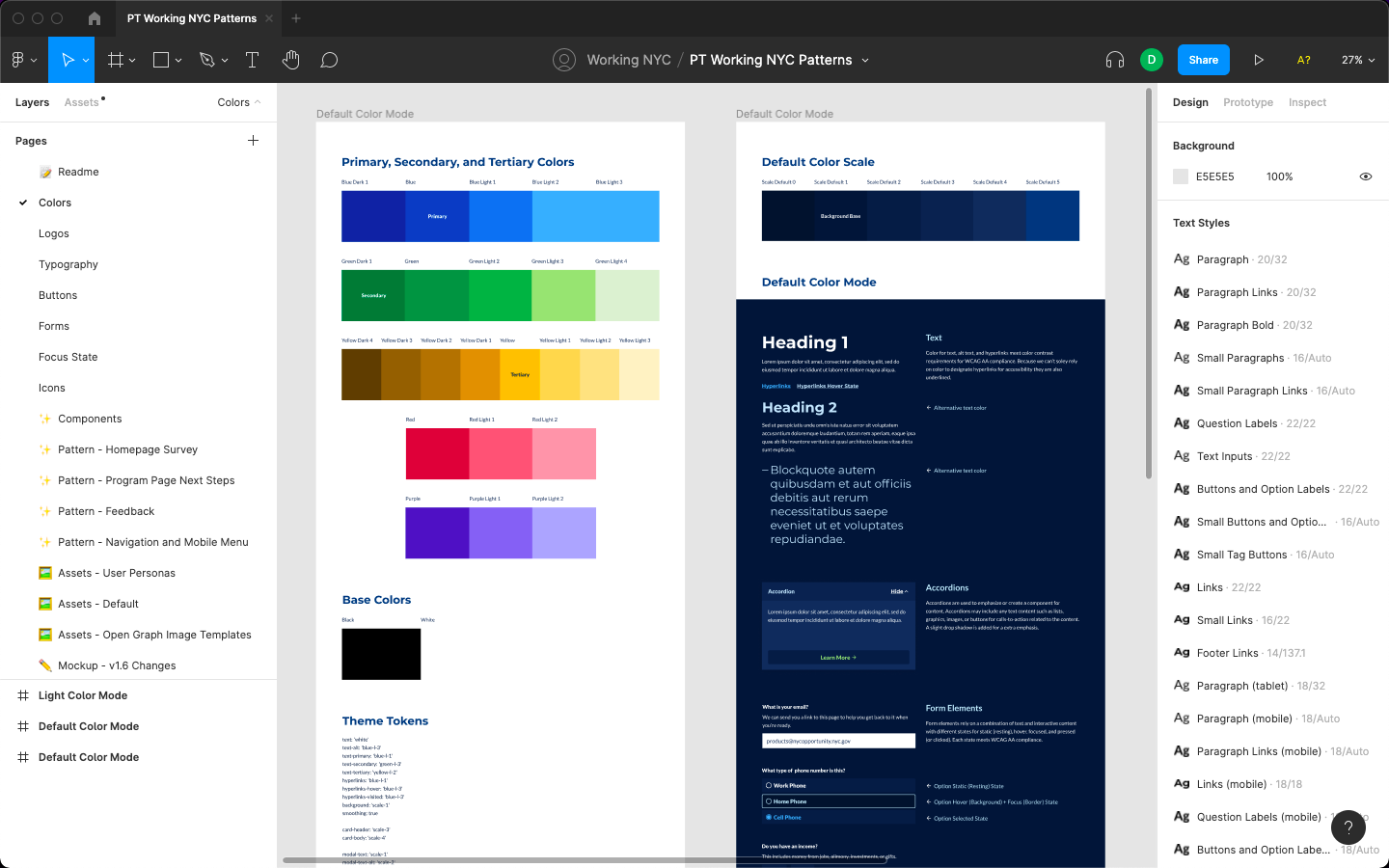
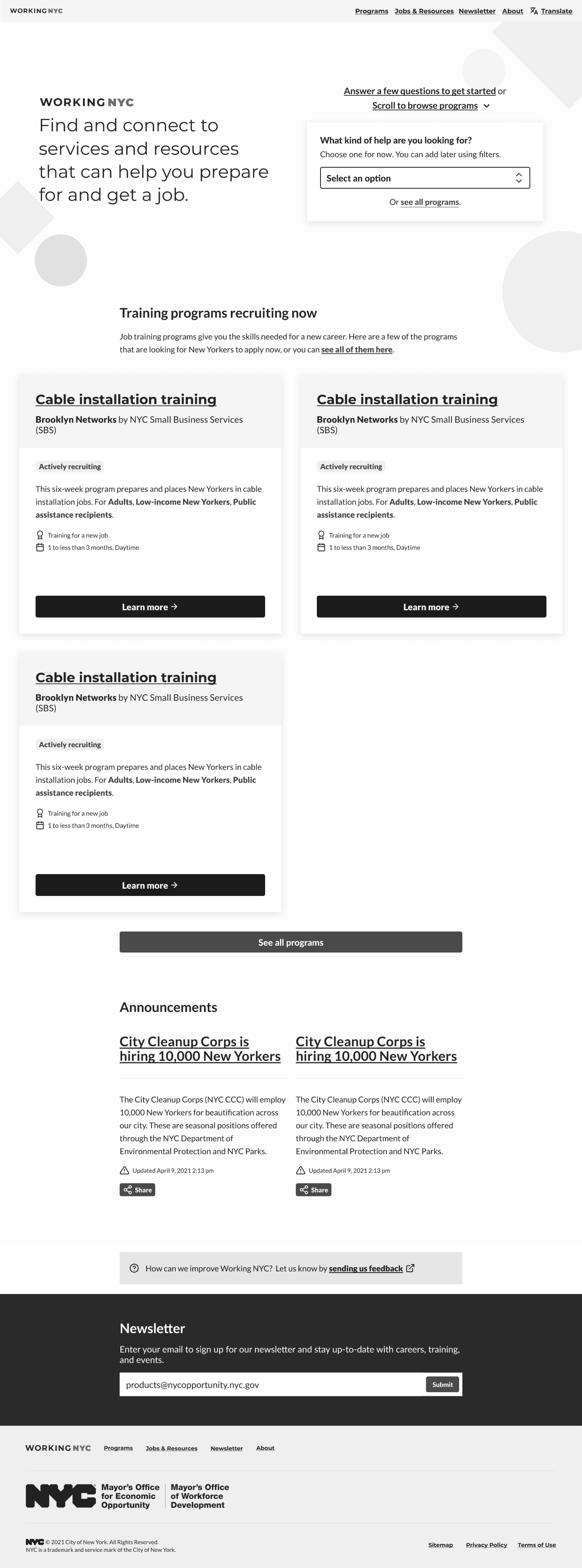
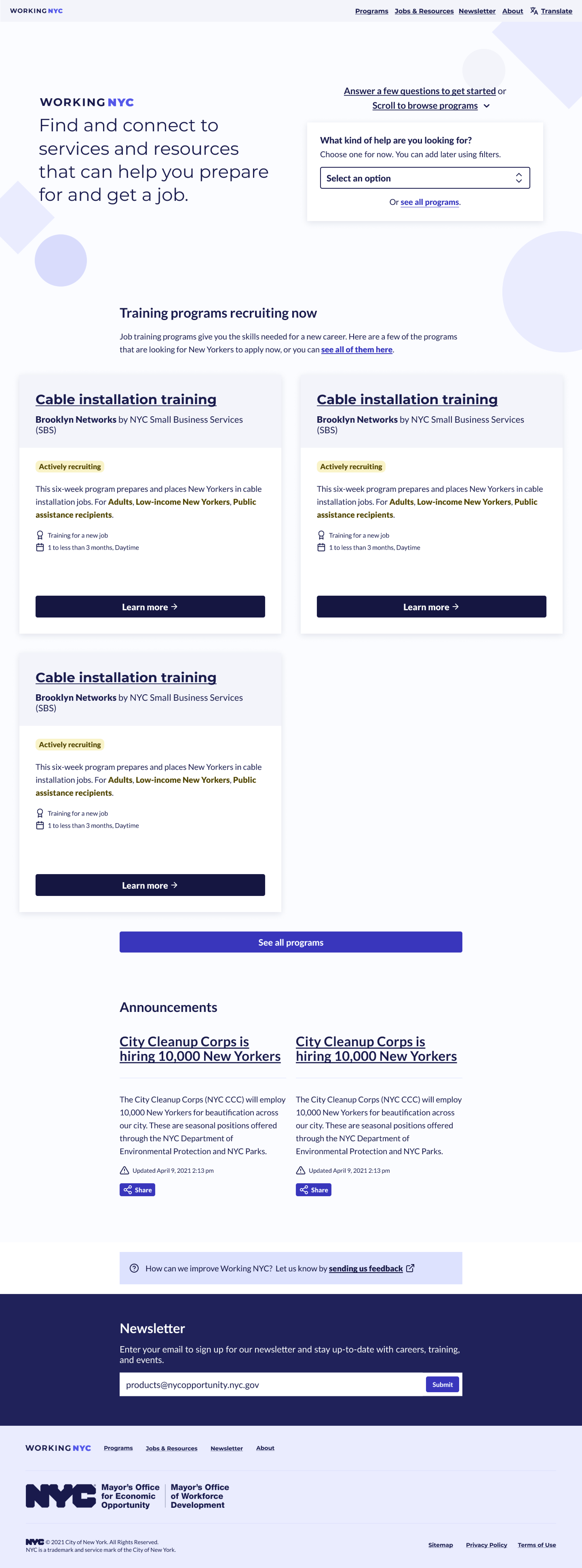
I designed the website using a color palette established by the Workforce Data Portal for its initial launch. To address the negative feedback on the original design, I oversaw the creation of a new light color palette by a fellow on our team. We ensured that the new color palette met WCAG AA color contrast standards.
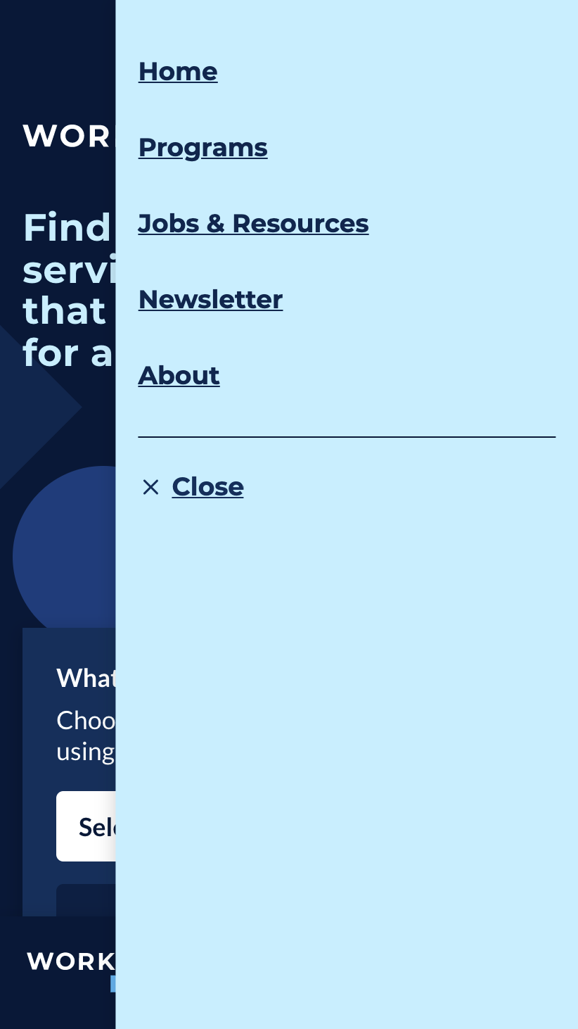
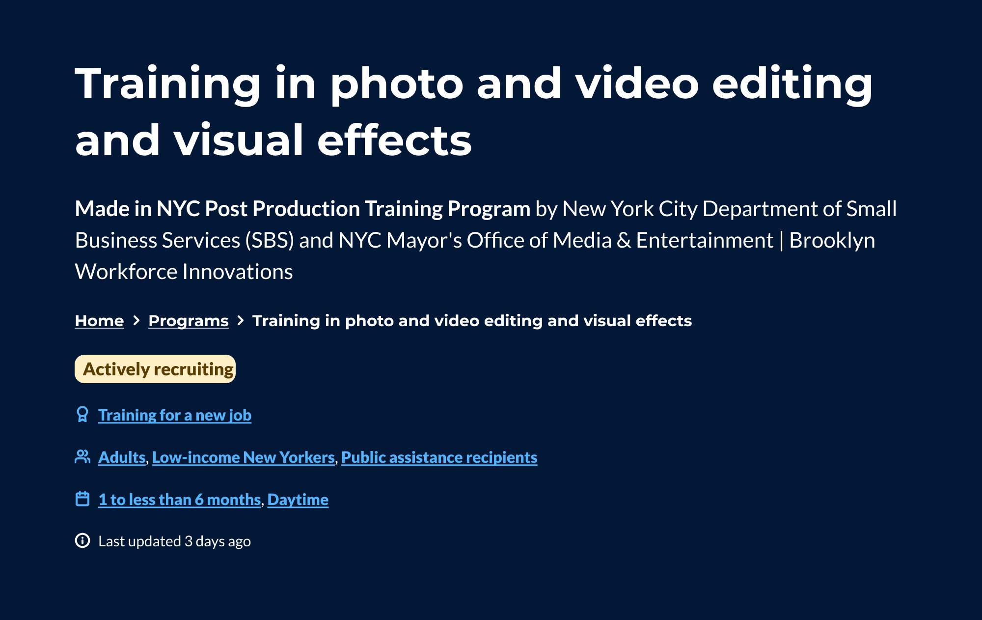
The homepage in the light color palette designed by our fellow.
The single program page in the light color palette designed by our fellow.
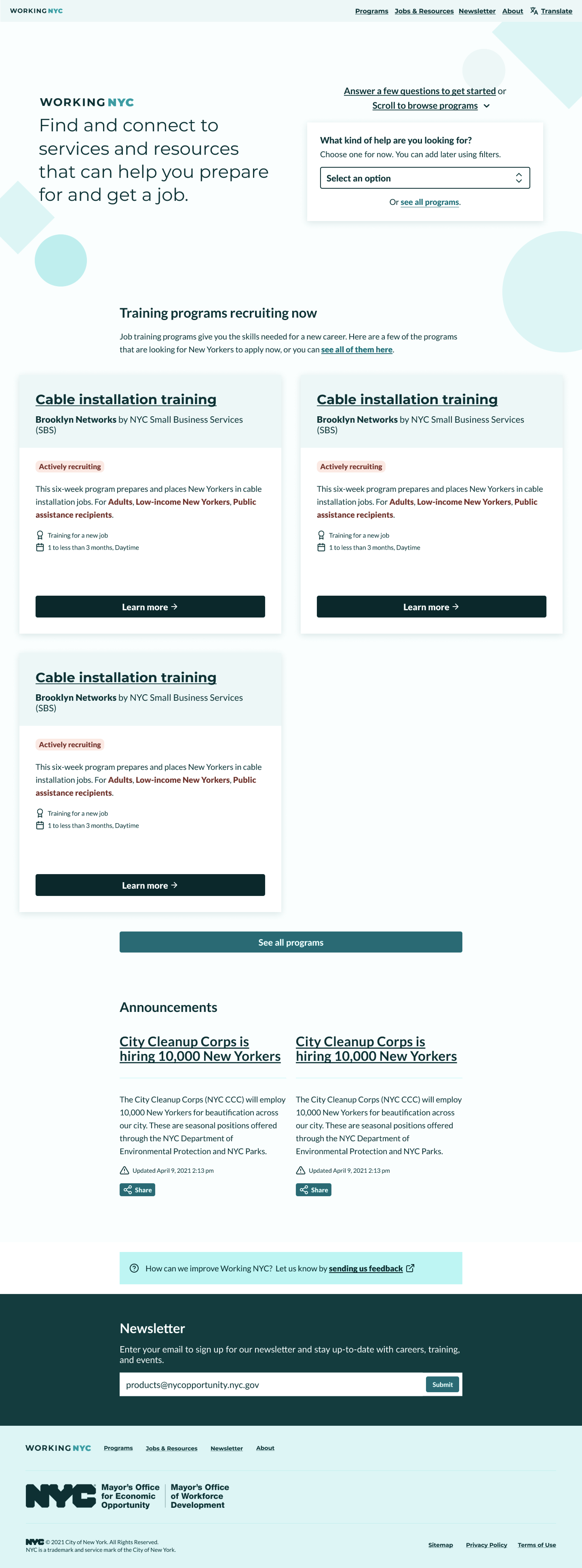
I worked with a research fellow to facilitate usability and preference testing interviews with users. We used these interviews to gauge which design users might prefer, light or dark, and ensure there were no major usability issues with the new light color palette. We also received consultation on low-vision usability with the Mayor's Office for People with Disabilities to assess the color contrast between the colors. They revealed that while the colors may have met WCAG AA standards, they needed further refinement to achieve better perceptual contrast.
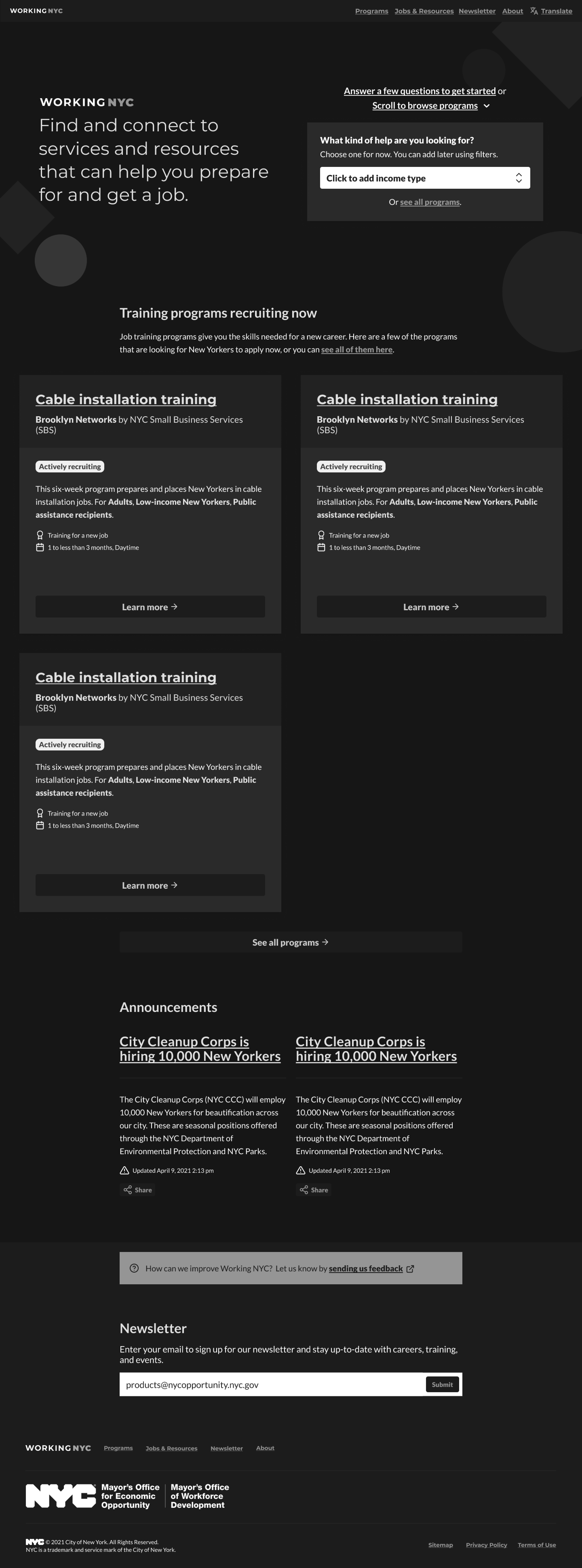
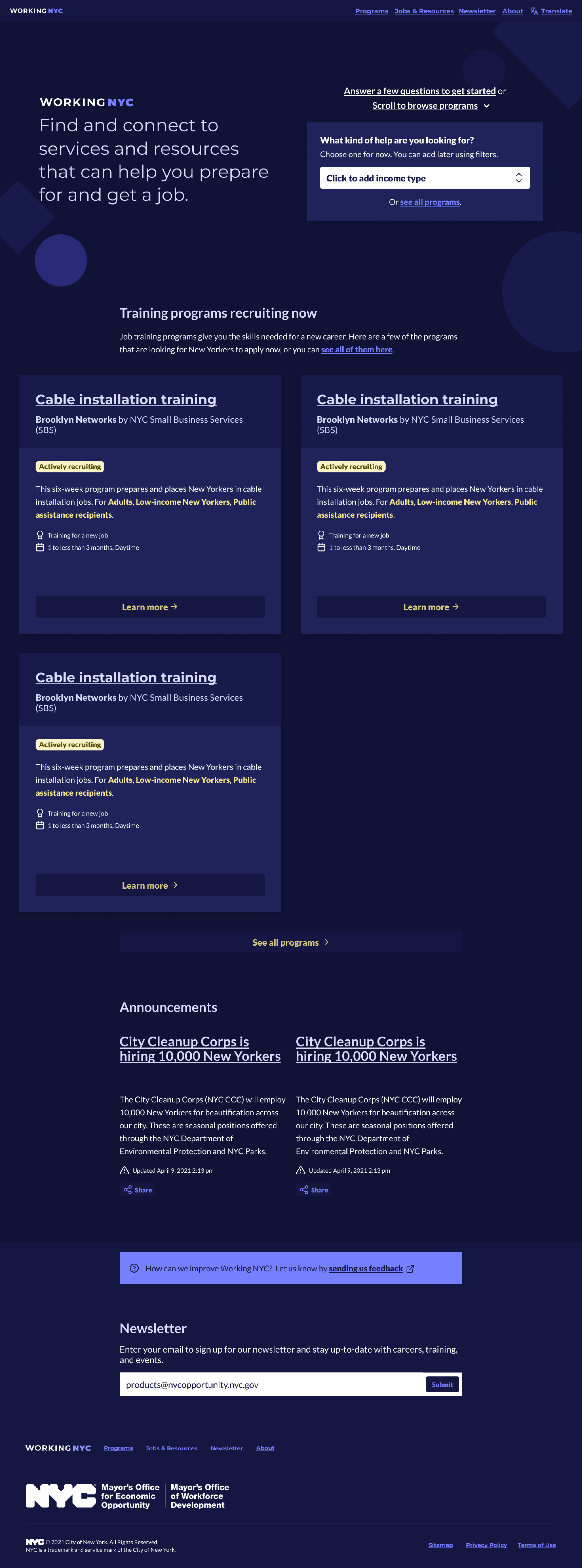
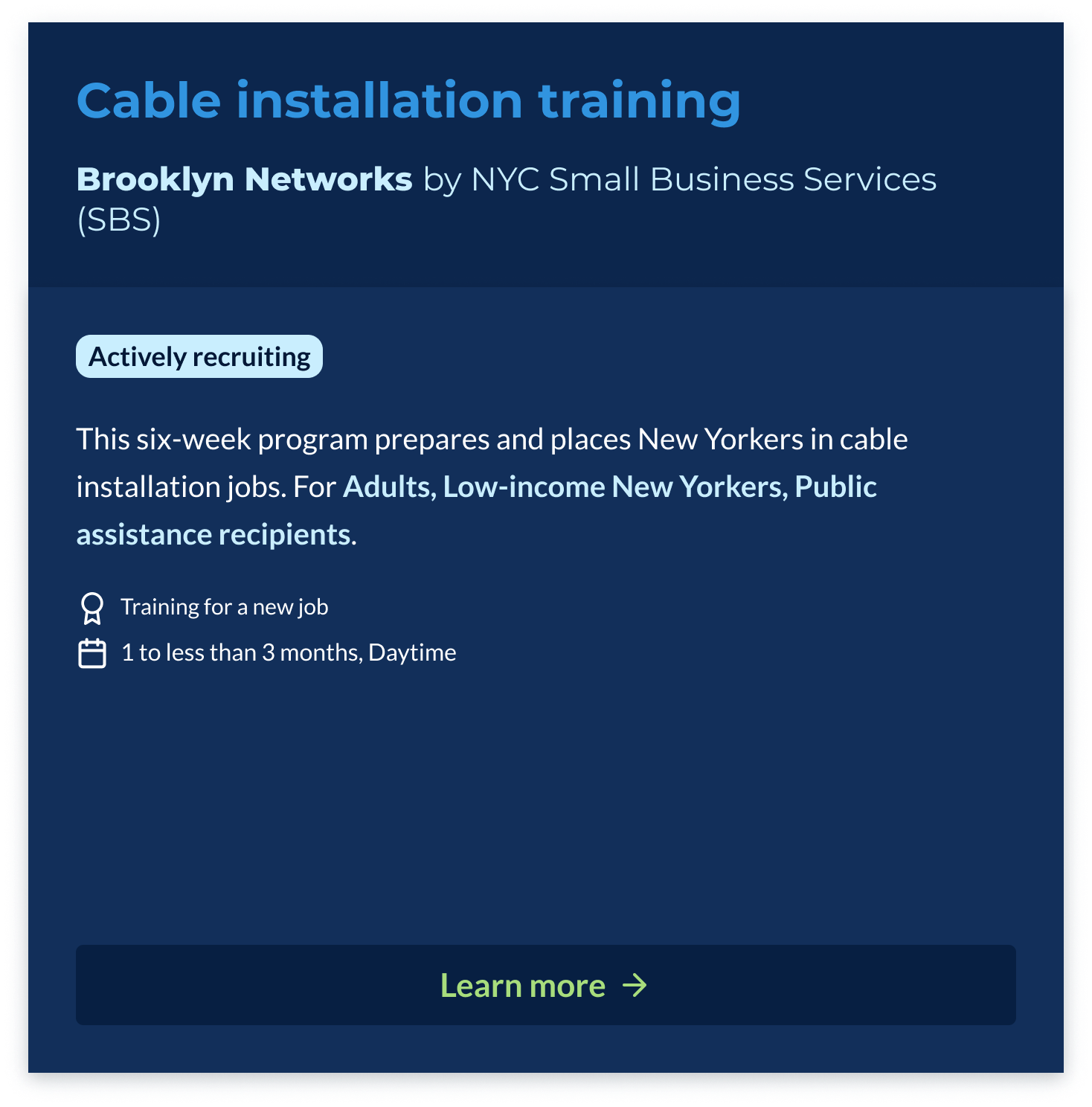
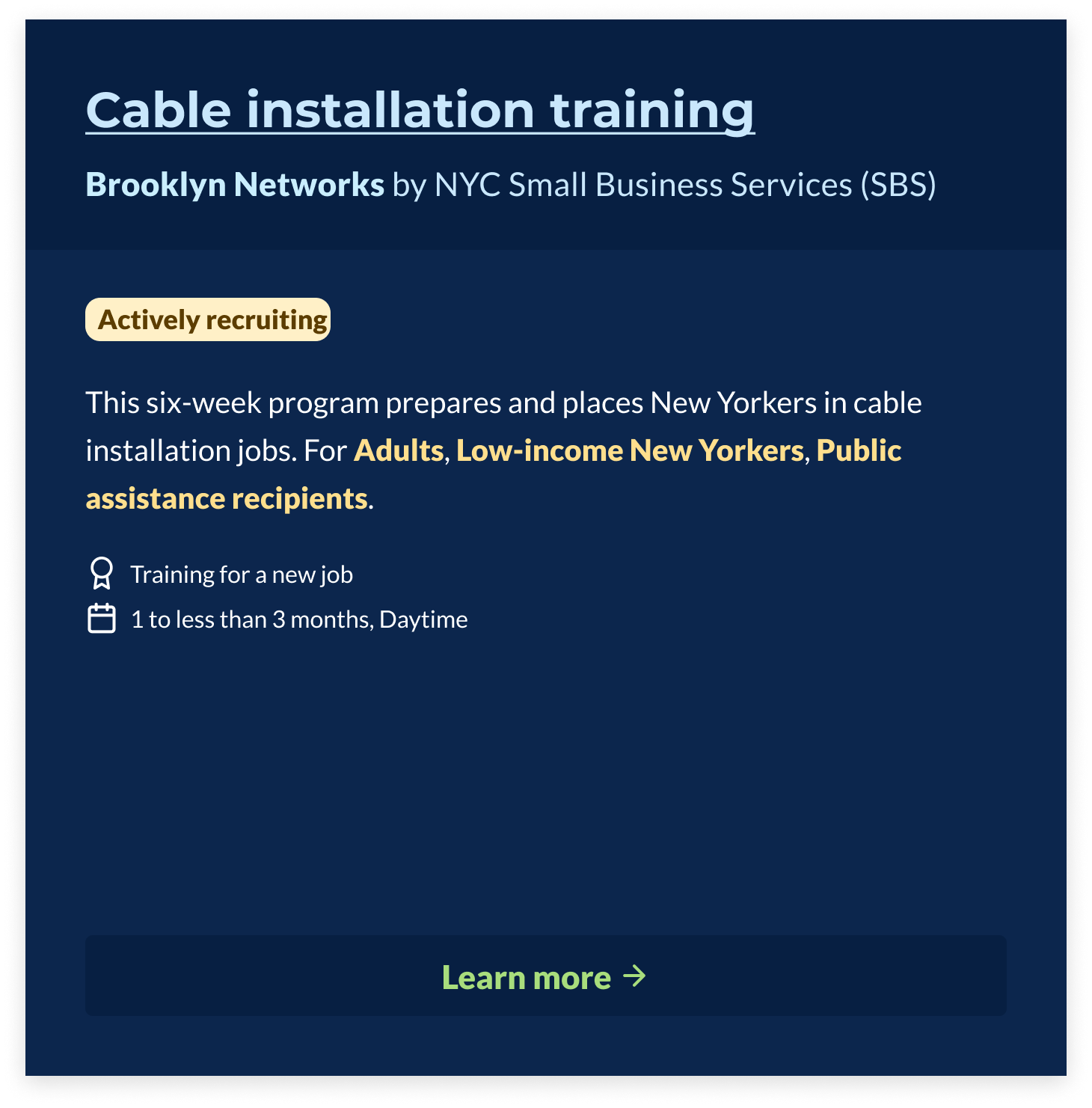
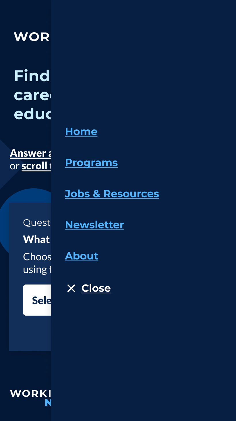
The default, or night color palette of the original design we tested.
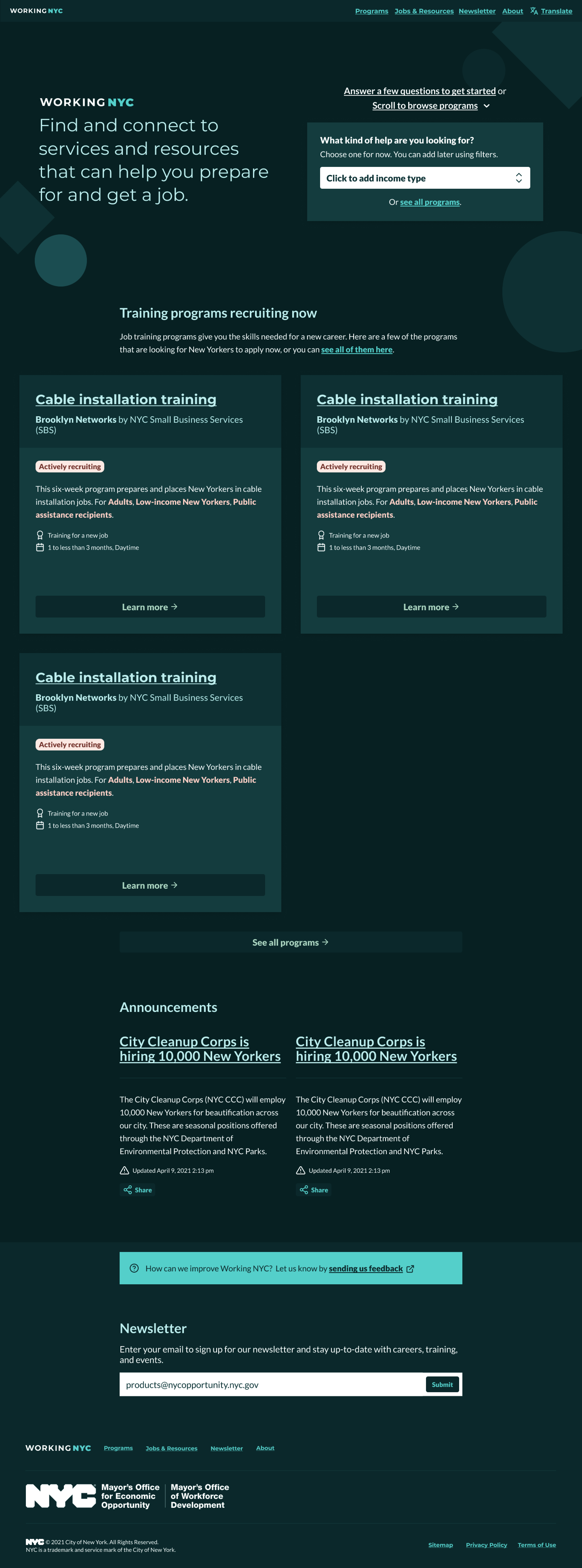
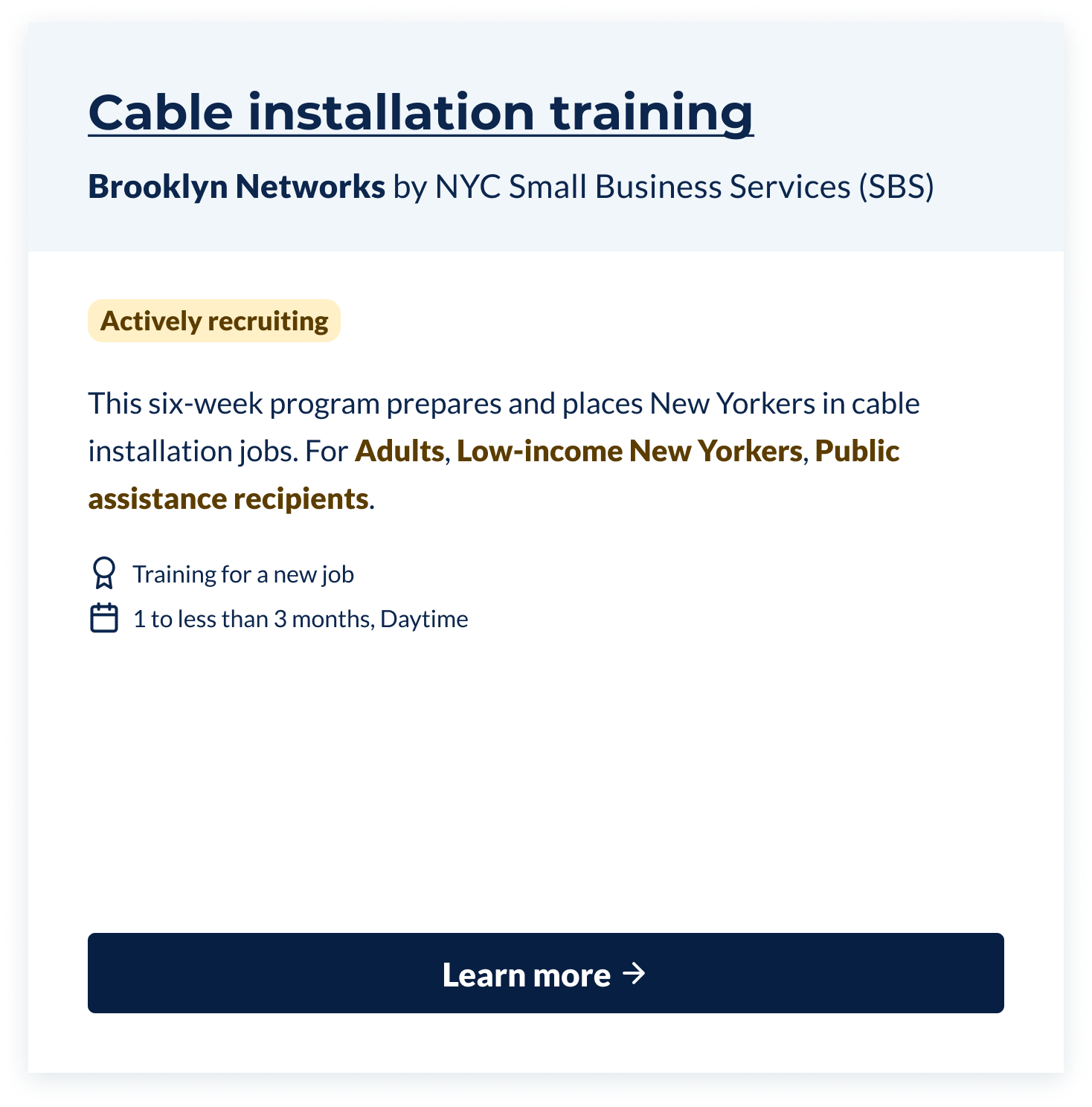
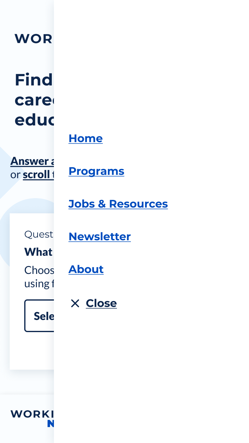
The day color palette of the design we tested.
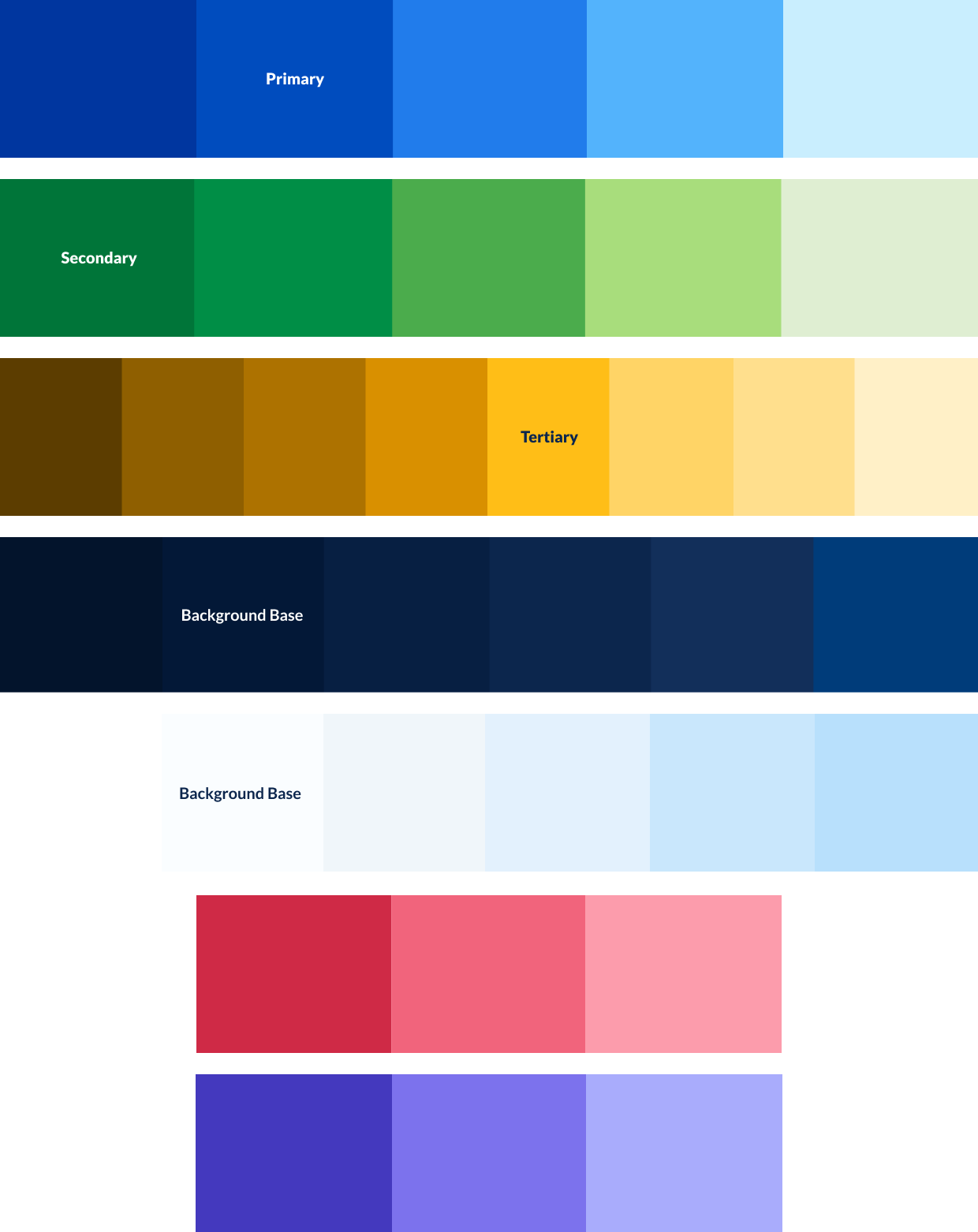
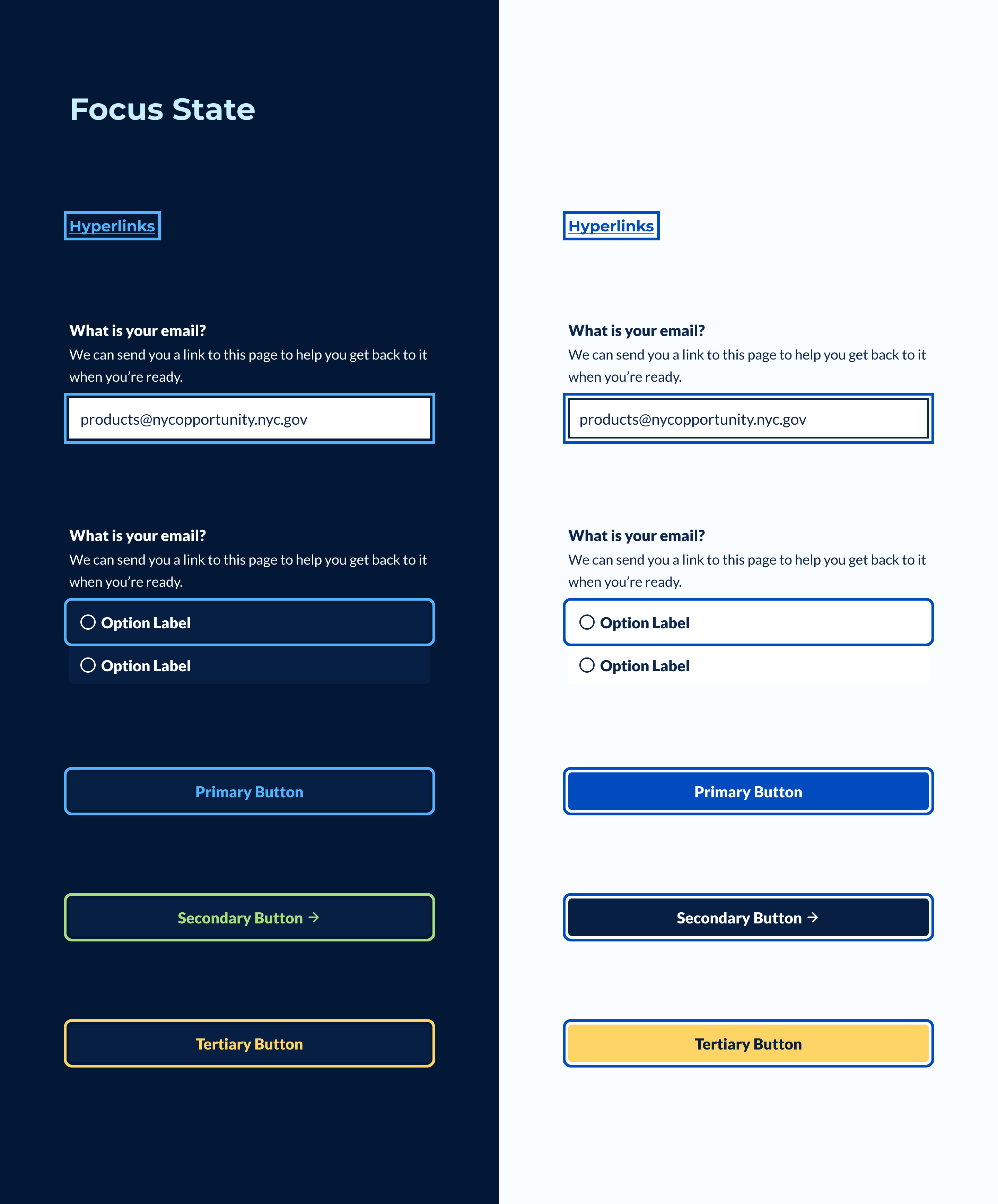
To implement findings from our research, I extracted the most up-to-date design tokens from the site's pattern library and updated the product Figma design file, adding color, typography styles, and symbols. The result was a complete set of design tokens and components to use in full page mockups and other designs.
Our research fellow also conducted desk research to understand how users with different color blindness would experience each palette and what color combinations work well for most color-blind users. She made more recommendations for our color combinations and evaluated them for contrast using a color blindness simulator commonly found in developer tools.
Simulated Achromatopsia for the default, or night theme.
Simulated Deuteranopia for the default, or night theme.
Simulated Tritanopia for the default, or night theme.
Simulated Achromatopsia for the light theme.
Simulated Deuteranopia for the light theme.
Simulated Tritanopia for the light theme.
After the conclusion of our usability and desktop research, we realized that providing alternate color themes is more than a matter of user preference. It is an inclusive design pattern that helps users with specific vision impairments.
As a result of this research and evaluation, we were able to enhance and standardize both light and dark color palettes for color-blind users and achieve full compliance with WCAG AA contrast standards and AAA standards in some cases for low-vision users.
Results
The final task was designing and testing a system for users to select their preferred color preference between light or dark modes. Our research fellow mocked up and quickly tested recommendations for a toggle for mobile and desktop users.


With our design recommendations finalized, I began implementing changes to the website's code-based UI pattern library. I refactored our stylesheets to support different color themes using CSS custom properties for all design tokens. Previously, design tokens were exported from JSON to Sass variables, becoming hard-coded at compilation. Using CSS custom properties allowed toggling color themes more fluidly in the browser.
The static HTML demonstration I created using the Working NYC pattern library. The theme toggle can be found behind the mobile menu button.
We released the Inclusive Color Patterns on December 21st, 2021.
Final final
The site's design is a collection of open-source code and public Figma file that can be scaled up as the product evolves. I also created internal documentation for all of the historical context behind the design so that team members can understand design decisions. You can browse the GitHub repository and the Figma file following the links below.