Jobs and opportunities content design
During one of the early phases of our work, I helped the team plan features we would prioritize for a quarter. I facilitated a proto-persona workshop to quickly align the team and help us work towards goals centered on job seekers. Each team member created a proto-persona. Additionally, I presented 11 possible features and backlog items we could focus on and asked the team to choose the features that would best help their persona achieve their goals. As a group, we discussed these personas and their intersections to raise awareness of everyone's assumptions and create hypotheses to validate through research and feature development.
| Persona attribute | Value |
|---|---|
| Name | John Worksalot |
| Age | 22 |
| Demographic Single, mother of two, student, etc. |
Young, single, man, HS graduate, father |
| Background What is the user’s story (not a list) and how they got to their present position? |
John is a lifelong resident of Brooklyn with a 2 year old daughter. He lives with his mother at NYCHA. He engaged with the City through SYEP as a high-school student which he learned about through word of mouth. |
| Goals What are their goals and what proposed (or unproposed) feature (or user interface tasks) will help them achieve that goal? |
He is eager to find steady, high-quality employment (benefits) with good pay so he can support his young family. John learns about a lot of opportunities through word of mouth especially from trusted peers and is very active on social media. It would be great to see more users sharing individual featured jobs with their networks.
|
The most common goals turned into 4 streams of work that our product manager delegated to different pairs of team members.
The stream of work I would lead was researching our Jobs & Resources content design.
Background
The Jobs & Resources page was a supplemental page with everything from large-scale hiring opportunities to seasonal jobs and career resources for smaller intersections of populations. Our partners at the Mayor's Office of Workforce Development would add to it as resources were reported. The content moderation process was informal. There was no schedule or structure compared to the standard program content on the site, which focused on job training and education.
The Jobs & Resources page.
Though supplemental, it drew more traffic than our featured program content. We wanted to explore this page and its appeal to users. Could we improve it? Were there any issues with the design qualities of the page? And, most importantly, did the content on the page help job seekers meet their goals?
I created a project plan following the feature development framework I established to help the team build user-driven features. I would research, gather data, document, and create a report on any insights discovered to my team.
Research plan
Quantitative analysis
I would inspect site analytics to get a high-level sense of user behavior.
Feedback analysis
See what stakeholders have said previously through surveys.
User experience (UX) audit
Perform a first-person audit of site features to see if there are any quick fixes.
Usability research
Perform usability studies to get feedback on the experience of the content.
Quantitative Analysis
We knew the page ranked higher than our primary content. Additional observations of the most inbound and outbound traffic correlate to mass hiring campaigns featured on the page:
-
City Cleanup Corps (CCC). The CCC employed 10,000 New Yorkers as part of an initiative to help revitalize the economy of the City during its recovery from the pandemic.
-
Vaccine for All Corps. The vaccine corps recruited 2,000 New Yorkers to assist in distributing the vaccine in their communities.
-
City jobs or Working for the City.
Tracking interactions on the page revealed job seekers clicked in-page links to either City jobs or Working for the City sections.
Supplementary content including skill–building, career exploration, and resources for veterans, ranked much lower by comparison.
Feedback analysis
I wanted to revisit the feedback from stakeholders on the product to see if there was anything specifically related to this page. I found some of the following direct quotes.
"Working NYC has no job listings for job seekers to review."
"As someone who does daily outreach, clients want jobs. They care about money right now because they are struggling greatly financially."
What was your favorite feature of Working NYC?
"The Links to the City job boards"
Analyzing these and other points of feedback led me to conclude the following.
-
The term "job" may be misleading, even if accurate.
-
Highlight some Job & Resources content on the homepage.
-
The page is easy to read, but legibility could be improved.
-
Discoverability may be an issue when looking for jobs from other parts of the site.
UX audit
I audited the site experience using the feedback analysis to see if I could understand and document the context behind my feedback analysis.
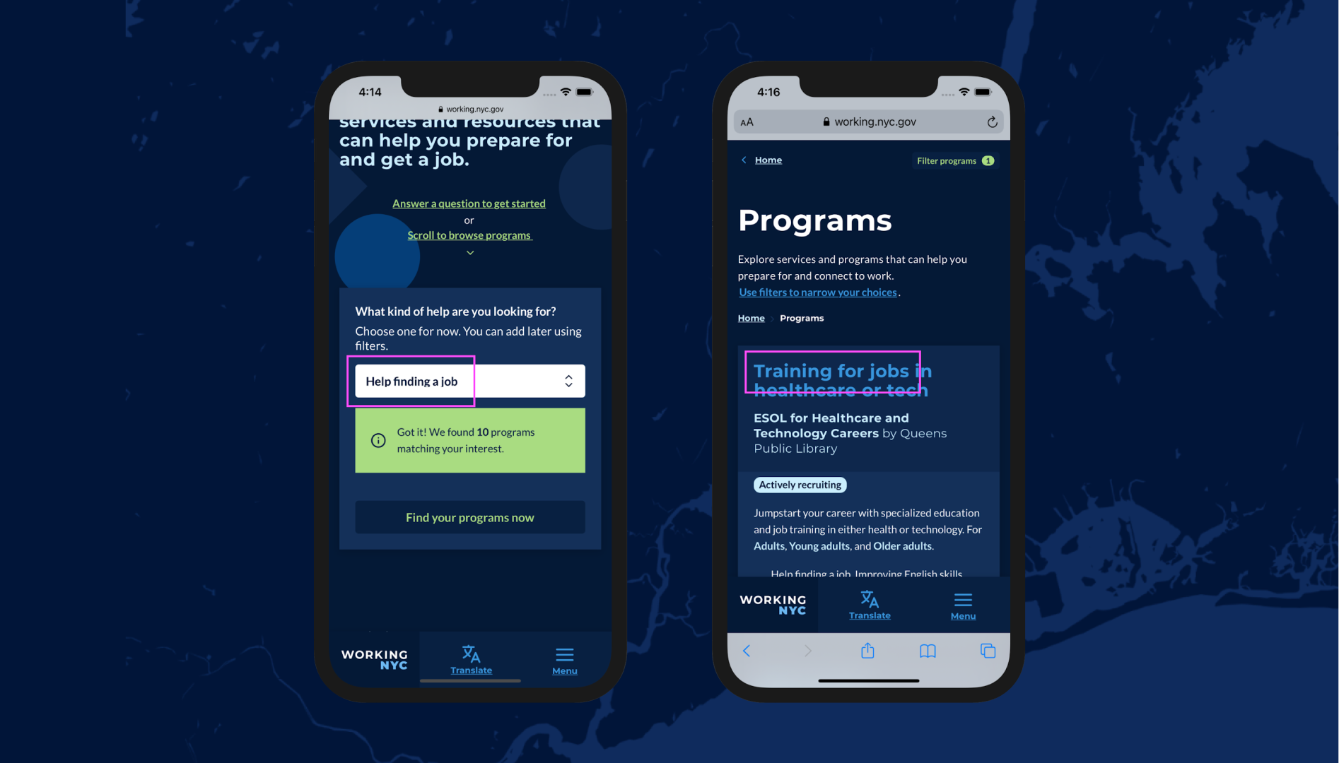
The questionnaire for filtering programs on the page returned results that may not match expectations. Particularly the "Help finding a job" taxonomy. The term is too broad and could be interpreted as a way to view job postings.
Usability research
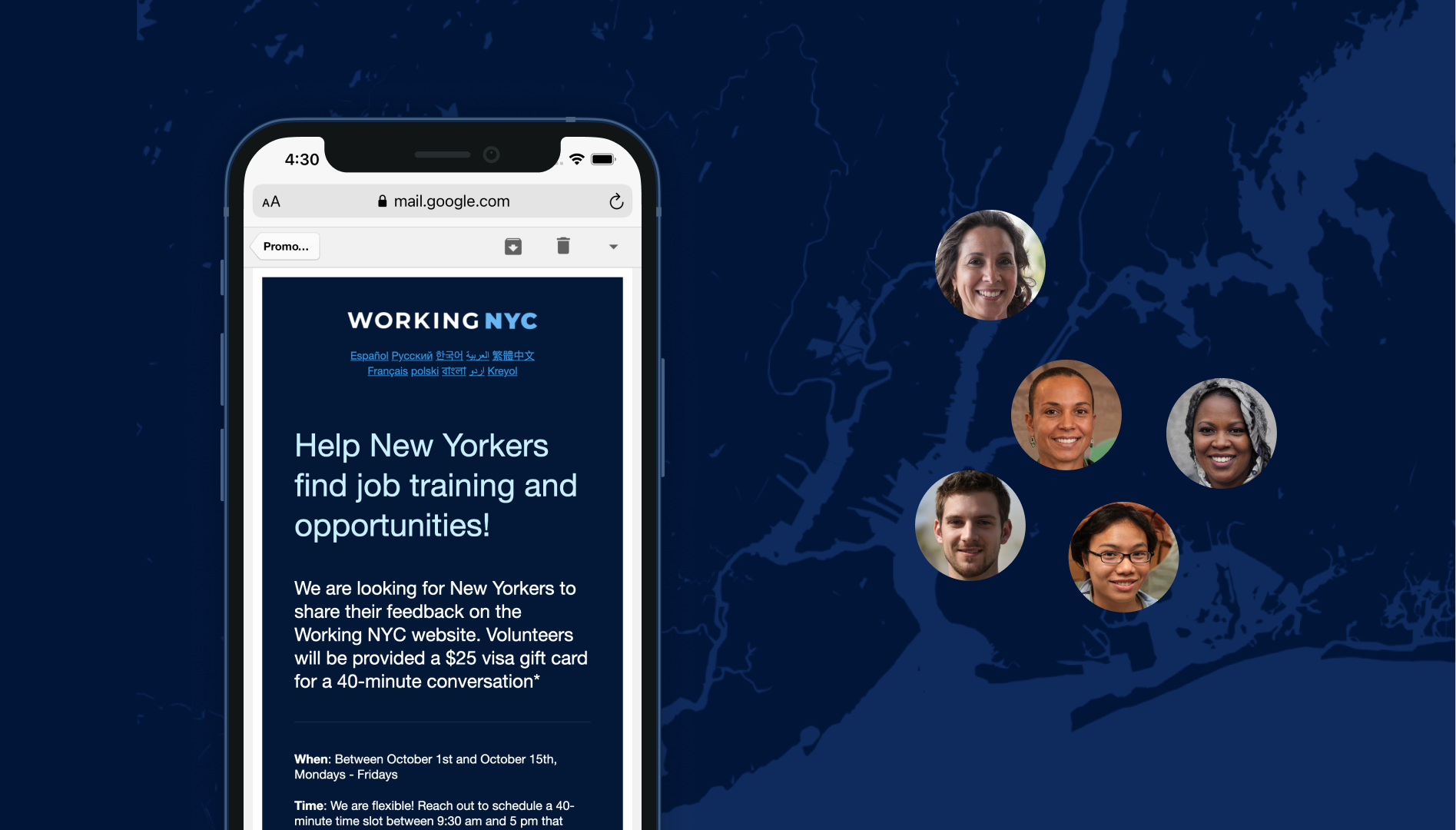
Through our newsletter, I recruited a small but diverse group of 5 user research participants, including students, City employees, and aging New Yorkers. I developed an interview guide and paired individual members of my team to conduct each interview session.
Through our interviews, we discovered the following insights;
-
The content was easy to read, but it was hard to scan. It should have structure, particularly with information about eligibility, scheduling, next steps, and call-to-actions.
-
Navigating City employment takes a lot of work. There is a lot of information we can provide to help users.
-
The terms "Featured Jobs" and "Community Hiring" are not distinct to our users.
-
The page's jump navigation is helpful but takes up too much space.
Recommendations
#1 Implement a horizontally scrolling jump navigation
#2 Adding structure and linking to more profound content types
By adding structure and linking to more profound content types we would be able to reduce the density and scroll length of the page. Through analysis of content in the page I recommended the following content taxonomies.
-
Featured Jobs created using structured content schema.
-
Guides to help audiences with specific interests find the resources they need.
Final Final
This research eventually led to creation of a jobs board that hosts structured content for entry-level positions. Without the jobs board, the site averaged about 3k users per month in the first year of its launch. After the featured job board release with around 30 jobs, the site averaged about 6k users per month. Additionally, the site averaged about 10 clicks daily via search for the first year. After releasing the featured job board, we averaged about 300 clicks daily.
This work enabled us to focus more on outcomes and quality in programs, jobs, and content we create, giving us a head start on a fast-following Mayoral initiative to create a single resource for New Yorker City employers and job-seekers. By demonstrating our ability to develop digital resources for this audience effectively, we were tasked by the administration to help with this effort. We collaborated with the Mayor's Office of Talent and Workforce Development, the Deputy Mayor's Office of Strategic Initiatives, and The Office of Technology and Innovation to release the second version of Working NYC for job-seekers and employers.